Mixed-Fleet Comparison Plates
A fleet graphics mockup can hold its hierarchy on one vehicle and lose it on the next. The body may stretch the wordmark, place a sponsor beneath a door seam, split a color block at the wheel arch, or leave too little uninterrupted graphic area for the main message.
The working decision is not which vehicle looks best in isolation. It is whether the same visual system survives different profiles, viewing distances, and panel structures.
Start with the hierarchy, then test the body.
What the Comparison Should Show
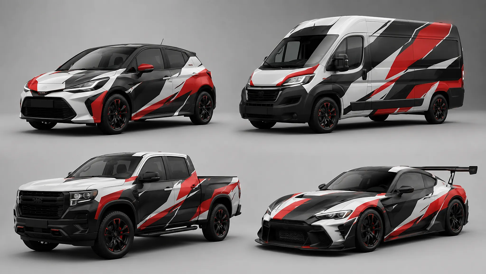
A mixed-fleet graphics mockup compares one visual direction across vehicles with different contours, doors, windows, wheel arches, and available graphic areas. It is a concept-stage review, not a measured production file or a record of final project approval.
Use the plates to answer four questions:
- Can the primary identity be found before supporting information?
- Do sponsor tiers retain their intended order?
- Does the colorway remain recognizable as the body shape changes?
- Which elements still register at distance or during a brief passing view?
A shared fleet appearance does not require identical artwork on every profile. It requires a recognizable relationship between the elements. A van, hatchback, race car, and pickup may need different positions, scales, or panel adaptations while retaining the same hierarchy.
The visible tradeoff is consistency versus vehicle-specific adaptation. A rigid layout preserves file structure but can create awkward panel breaks. A flexible layout can fit each profile more naturally, yet it needs clearer rules for sponsor scale, color boundaries, and identity placement.
Hold the Comparison Condition Steady
Place the vehicle profiles under comparable conditions before judging the graphics. Keep the background, image scale, viewing angle, and presentation format as consistent as the mockup allows.
Controlled visual-comparison methods use consistent stimuli because changes in angle, display size, or visual noise can obscure the difference under review. That method creates a stronger discussion condition; it does not establish a universal result for recognition, visibility, or performance.
Review every profile in the same order:
- Silhouette: note the roof line, hood line, windshield, rear quarter, and wheelbase.
- Primary identity: locate the main mark or team identity without reading every supporting detail.
- Colorway: follow the dominant color block across doors, arches, bumpers, and rear surfaces.
- Sponsor hierarchy: compare primary, secondary, and supporting tiers by scale, contrast, and position.
- Panel interruptions: mark doors, seams, handles, hinges, glass lines, and wheel arches.
- Distance read: reduce the image or inspect it from farther away, then record what disappears first.
- Motion read: consider the side view as a passing vehicle rather than a static poster.
A useful comparison plate makes these differences visible without requiring the reader to remember which condition changed between images.
Fleet Graphics Visual Hierarchy Across Profiles
Hierarchy is the order in which the eye encounters the design. That order can change even when the artwork appears identical.
A large logo on a flat side panel may dominate a compact vehicle. On a taller van, the same logo may sit below the natural eye line, compete with a sliding-door seam, or become isolated by a large window. A sponsor block that feels secondary on a long side profile may become the largest uninterrupted element on a shorter vehicle.
Review each element by role rather than by file position:
| Element | Comparison question | Visible failure signal |
|---|---|---|
| Fleet or team identity | Can it be found before supporting information? | It merges into a color block or panel break. |
| Primary sponsor | Does its scale remain distinct from secondary tiers? | It appears equal to several smaller marks. |
| Secondary sponsors | Do they support the system without forming a crowded strip? | The lower body becomes a logo inventory. |
| Colorway | Does it connect the profiles visually? | Each vehicle appears to use a separate design. |
| Identifier text | Does it remain subordinate in the intended view? | Small text dictates the whole layout. |
| Decorative graphics | Do they reinforce the direction? | Stripes or shapes compete with the identity. |
Hierarchy must survive substitution.
Do not inspect only the largest side panel. Compare side, front three-quarter, rear three-quarter, and any view used for the approval conversation. A sponsor can dominate from one angle and disappear from another as the glass line, wheel arch, or bumper changes the visible field.
Body Lines, Panel Breaks, and Wheel Arches
Body lines can carry a graphic across a vehicle, but they can also make a shared layout appear distorted. A stripe that follows the shoulder line on one profile may rise above the door handle on another. A diagonal may align with the rear quarter of a hatchback and terminate abruptly at a van’s sliding door.
Separate three observations:
- Form alignment: does the graphic appear to follow an existing contour?
- Hierarchy alignment: does that contour lead attention toward the intended identity?
- Production dependency: does the idea rely on a line that must be confirmed on the actual vehicle?
The first two are visible in the mockup. The third belongs to the designer and installer. Use a body line as a comparison reference, not as proof of fit; vehicle-specific measurements, photographs, panel mapping, and current body information still determine the production question.
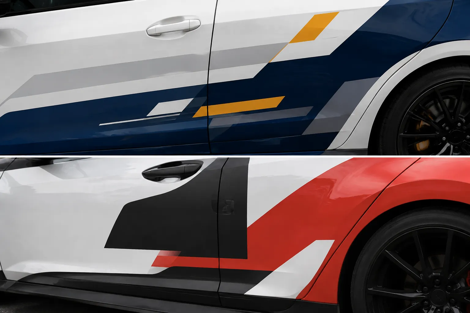
Panel breaks divide a graphic into moving and fixed surfaces. Inspect whether a wordmark crosses a door seam, a sponsor sits partly on a moving panel, a stripe changes direction at a wheel arch, or a contrasting block ends at different points across the fleet.
A seam may be acceptable when it passes through a background field. It becomes more disruptive when it cuts through a letterform, sponsor symbol, or boundary between color fields.
Wheel arches need the same discipline. A graphic that follows the arch can feel integrated on one profile, while a higher or deeper arch on another body shifts the apparent weight toward the front or rear.
Do not remove every interruption automatically. Record the tradeoff:
- Continuity may support fleet recognition while creating a difficult panel transition.
- A panel break may improve local clarity while weakening the shared visual rhythm.
- Moving a sponsor may protect the mark while reducing available area for a secondary element.
The role of the element and the actual vehicle profile decide which compromise is acceptable.
Group Vehicle Profiles by the Problem They Introduce
Vehicle names alone do not explain how a layout changes. Group the profiles by the visual condition they create, then compare the same identity rules across those conditions.
Low, Compact Profiles
Low vehicles may provide a long visual sweep, but the side area can be interrupted by a short roof, low glass line, or large wheel proportion. A horizontal identity may read in side view and disappear in a three-quarter view.
Check whether the primary mark remains visible between the wheel arch and glass line. Compare its role with taller profiles rather than transferring the same vertical measurement by habit.
Tall Vans and Utility Bodies
Tall profiles can appear to offer more surface area, yet doors, handles, windows, seams, and varied panels may divide that area into separate fields. A large blank panel is not automatically a coherent graphic area.
Look for a stable visual anchor near the center of the side profile. Review the rear separately because its information field and viewing condition may differ from the side.
Pickups and Open-Bed Profiles
The cab, door, bed, and rear quarter may read as separate zones. A stripe that connects them in a side mockup may not create the same connection from the front or rear.
Decide whether the bed belongs to the main identity field, a sponsor field, or a supporting color field. Record that choice before adapting the direction to another body type.
Race and Performance Profiles
Low noses, wide arches, split body surfaces, and aerodynamic forms can create strong visual movement. They can also fragment sponsor placement and make a logo readable only from one angle.
Review the identity first at the intended viewing distance. A detailed static render may lose sponsor order when the vehicle is seen briefly or from the side.
Sponsor Tier Hierarchy Is a Fleet Decision
Sponsor hierarchy should be compared as a system, not judged one mark at a time. A primary sponsor usually needs a visibly stronger combination of scale, contrast, position, or repetition than a secondary sponsor.
- Does the primary sponsor occupy the most valuable uninterrupted area?
- Does a secondary sponsor become larger because one vehicle has fewer panel breaks?
- Does a high-contrast mark overpower the intended primary identity?
- Do repeated small marks form a competing band?
- Does a sponsor disappear behind a wheel arch or door division?
- Does the colorway change the apparent rank of the same mark?
Avoid solving every difference by enlarging a logo. Placement, contrast, breathing room, repetition, and proximity to the main identity also affect the read.
Rights review remains separate from visual review. A mockup can show where a sponsor mark is intended to appear, but it cannot establish permission to use, alter, reproduce, or reposition that mark. The rights holder or vehicle owner must confirm the relevant permissions.
Distance and Motion Are Review Conditions
Distance review is a comparison prompt, not a performance claim. Reduce each vehicle image until supporting details begin to disappear, then record which elements remain available:
- Overall colorway
- Main graphic silhouette
- Fleet or team identity
- Primary sponsor
- Secondary sponsor tier
- Small text and contact details
Research on visual communication and controlled image comparison supports hierarchy, contrast, and consistent viewing conditions as useful review concepts. Findings from adjacent text or symbol studies should remain prompts, not transferred measurements for fleet graphics.
The practical question is narrower: what does the reviewer identify first, and does that order remain consistent across profiles?
Motion adds another constraint. A passing vehicle offers less inspection time than a stationary render. If the direction depends on several lines of text, detailed sponsor marks, or a narrow contrast difference, record that dependence as an unresolved design condition.
Read order beats detail count.
Available Graphic Area Is Not a Shared Constant
The total exterior surface is not the same as the area that can carry a coherent identity. For each profile, note:
- Uninterrupted side area
- Distance between wheel arches
- Glass-line position
- Door and panel divisions
- Handles, hinges, vents, and trim
- Curved or tapered surfaces
- Front and rear areas for supporting information
- Surfaces requiring separate production review
Vehicle specifications can help identify the correct body information for a particular model. They do not represent every year, body variant, trim, or modified vehicle in a mixed fleet. Confirm the exact vehicle identity and measured references before treating dimensions as project facts.
The mockup should show a design rule rather than pretend that every profile has the same canvas. For example, the primary identity might occupy the largest uninterrupted side field available on each vehicle, while the secondary sponsor tier adapts around the panel structure.
That is a reviewable rule. A copied measurement is not.
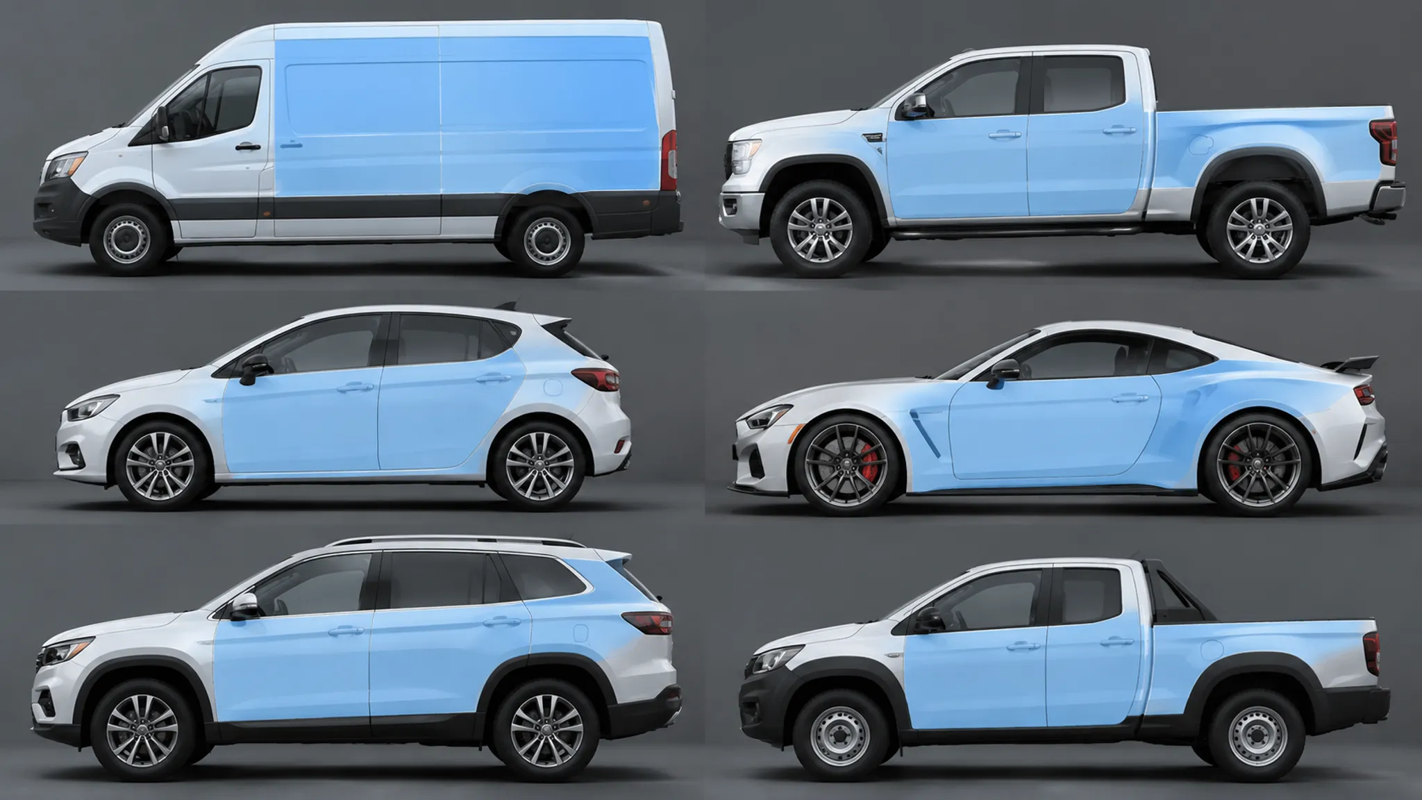
A Repeatable Review Workflow
1. Fix the Comparison Condition
Use matching views, image scale, background treatment, and presentation order. Label the vehicle profile and colorway on every plate. A comparison becomes difficult to defend when one profile uses a close crop and another uses a distant view.
2. Mark the Visual Anchors
Identify the main identity, primary sponsor, secondary sponsor field, dominant color boundary, and supporting information. Do not begin by correcting individual logos. Ask whether the anchors occupy comparable roles across the fleet.
3. Trace the Interruptions
Mark doors, seams, wheel arches, glass lines, handles, and other visible divisions. Short records keep the discussion concrete:
- Primary mark crosses the front door seam.
- Color block ends before the rear wheel arch.
- Secondary sponsor becomes dominant on the short profile.
- Rear identifier has no comparable field on the low vehicle.
4. Review at Three Distances
Use close, working, and reduced views. The close view checks placement, the working view supports normal review, and the reduced view exposes hierarchy. Tie every observation to the shown image, angle, display, and viewing condition.
5. Compare Variants Under the Same Condition
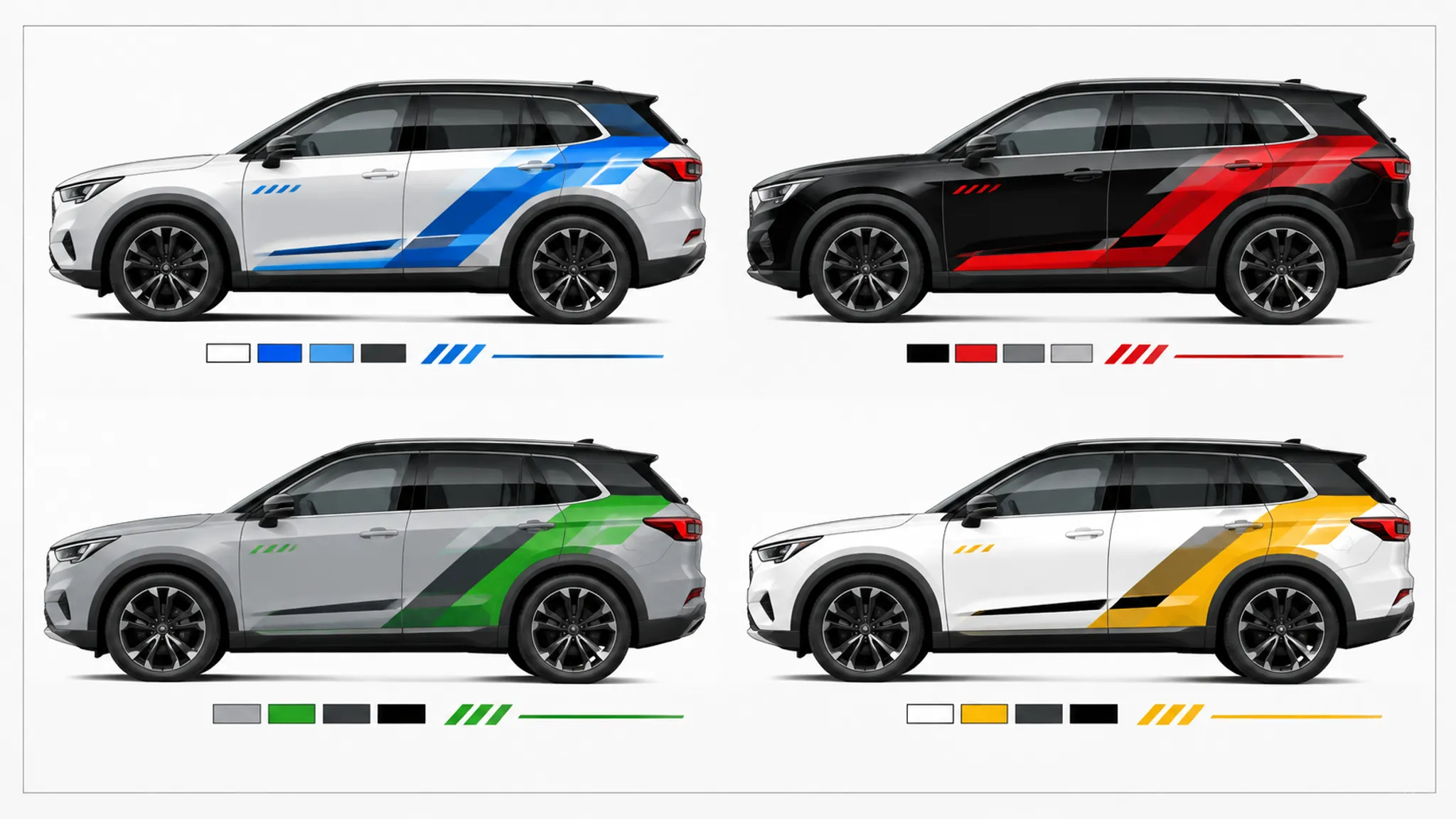
Place colorways or sponsor arrangements side by side on the same profile and view. Repeat the comparison on the most different body. The stronger direction is the one that retains its intended order with fewer special explanations, not necessarily the one with more detail.
6. Record the Decision and Dependency
For each vehicle, record the chosen direction, reason, visible tradeoff, unresolved measurement question, preflight question, rights question, material or surface question, and responsible next party.
This record keeps a visual preference from becoming an undocumented production assumption.
Common Misunderstandings
Identical Artwork Produces Identical Hierarchy
The same artwork can change emphasis when the profile, panel breaks, and available area change. Preserve the hierarchy rules, then adapt placement to the body.
A Continuous Side Stripe Connects the Fleet
A stripe may connect the fleet in a flat side render and break apart from a three-quarter view. Inspect the color boundary from the main approval angles.
More Surface Area Means More Usable Space
A tall van may have a large side panel that is divided by doors, handles, windows, and seams. Judge the uninterrupted field, not the total exterior surface.
Enlarging a Sponsor Solves Its Visibility Problem
Scale is only one part of hierarchy. A larger mark can become too dominant, cross a panel break, or compete with the main identity.
The Most Favorable Vehicle Represents the Fleet
Showing only the easiest profile hides the decision under pressure. Put the most different bodies into the first comparison set and inspect the difficult profile early.
What the Mockup Can Establish
In the shown concept, a fleet graphics mockup can demonstrate relative hierarchy, colorway relationships, intended sponsor tiers, approximate placement, body-line interaction, panel-break conflicts, wheel-arch treatment, and differences in available graphic area.
It cannot establish exact fit on an unmeasured vehicle, print accuracy, material suitability, surface compatibility, installation outcome, road-use requirements, or sponsor permission. Manufacturer guidance can identify questions about vehicle information, materials, application, and installation; it does not independently validate a particular mockup or project result.
Installer Handoff: Carry the Open Questions
The handoff should include the comparison plates, source vehicle information, revision record, and unresolved dependencies. The designer or producer should identify:
- Which profile controls the main adaptation?
- Which body lines are intentional alignment references?
- Which panel breaks must remain clear of logos or text?
- Which sponsor marks have confirmed artwork versions?
- Which color specifications require confirmation?
- Which surfaces need separate review?
- Which dimensions are measured and which are estimated?
- Which views represent the intended approval condition?
- Which elements may change during preflight?
- Which questions require rights-holder or vehicle-owner sign-off?
The installer can then assess project-specific surface conditions, panel handling, application conditions, and installation constraints. Those questions belong downstream because the mockup alone does not answer them.
A useful handoff states what has been decided and what remains open.
FAQ
What is the purpose of a mixed-fleet graphics mockup?
It compares one graphics system across different vehicle profiles. The review focuses on hierarchy, colorway, sponsor order, identity placement, and the effects of body shape and panel structure.
Should every vehicle use the same artwork?
Not necessarily. A mixed fleet usually needs shared rules with vehicle-specific placement. Identical artwork can create different visual results when doors, wheel arches, glass lines, and available graphic areas change.
How do I compare fleet graphics fairly?
Use comparable views, display sizes, backgrounds, and viewing distances. Ask the same hierarchy questions of every profile, then record the visible tradeoff.
Can a vehicle specification replace measurement?
No. A specification may help identify dimensions and body information for a particular vehicle. Confirm the exact model, year, body variant, and measured references before treating those dimensions as project facts.
Does a visual mockup establish that the wrap will fit?
No. It shows an intended visual direction. Fit, material suitability, print accuracy, surface compatibility, and installation outcome require current project documents and confirmation from the responsible producer or installer.
How should distance review be used?
Use it to identify which elements remain visually available as the image becomes smaller or more distant. Keep the observation tied to the mockup, angle, display, and viewing condition.
When can the direction move to the next handoff?
Move it forward when the chosen hierarchy, vehicle adaptations, visible tradeoffs, and unresolved questions are recorded. Measurement, preflight, rights review, material confirmation, and installation decisions remain with the responsible parties.
Final Checkpoint
Choose the direction that preserves the intended read across the most different vehicle profiles. Record where it changes, why the change is acceptable, and who must confirm the remaining production questions.
The mockup settles direction, not production.
Sources
- Visual Communication in Shared Mobility Systems as an Opportunity for Recognition and Competitiveness in Smart Cities - Used for context on fleet recognition and visual consistency; it does not provide mixed-fleet testing or project-specific visibility results.
- Experimentation in Car Styling Research: The Merits of Stimuli Design and Experiment Design - Supports the use of controlled comparison conditions when reviewing vehicle images.
- 3M Vehicle Graphics and Wraps Support - Provides manufacturer documentation for downstream vehicle-graphics, application, and installation questions.
- Avery Dennison Graphics Application Resources - Provides manufacturer guidance for material application and related handoff questions.
- Ford Pro Commercial Vehicle Specifications - Illustrates the need to identify the exact vehicle model and body information before treating dimensions as project facts.