White-Vehicle and Black-Vehicle Fleet Colorway Comparison
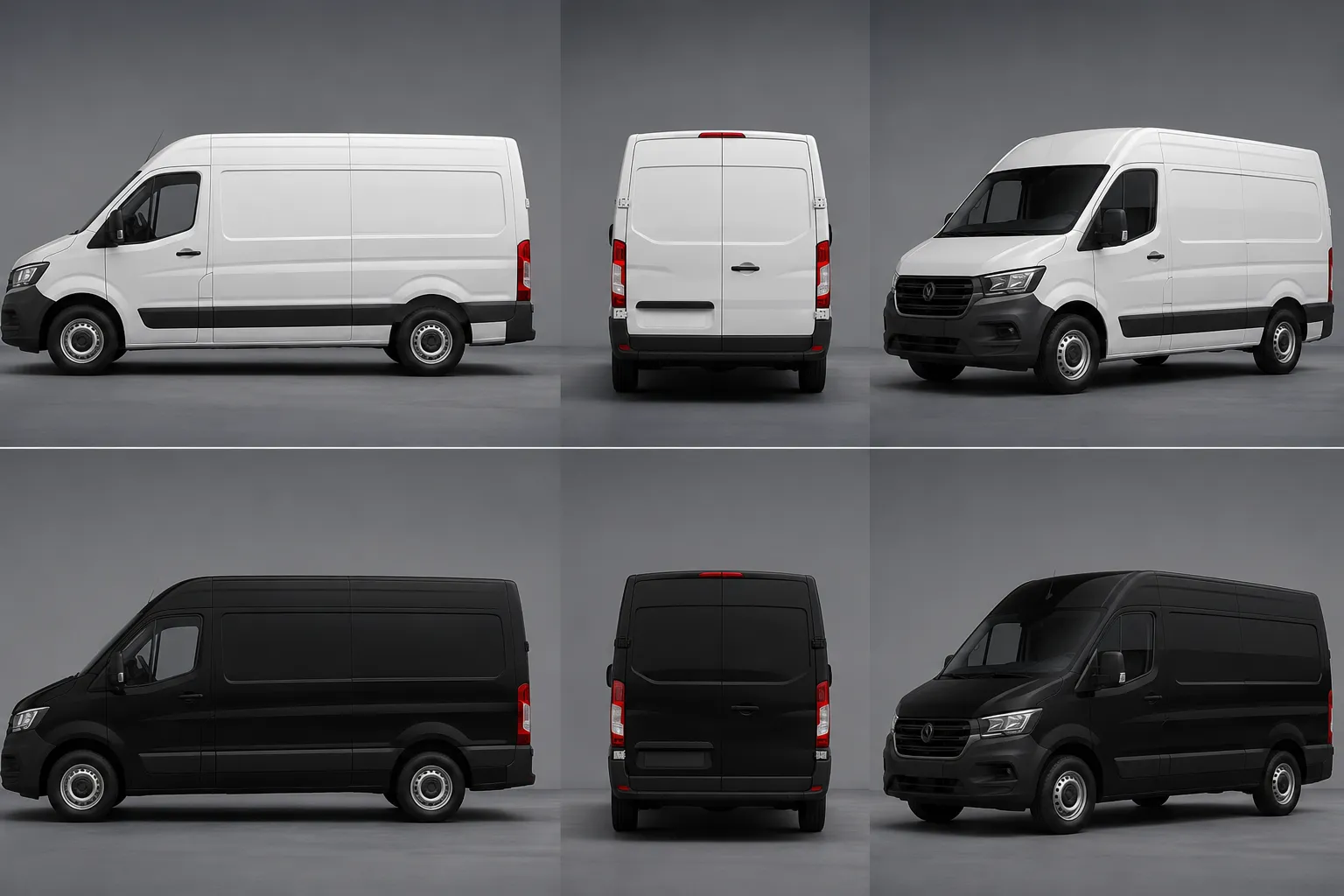
When the same fleet graphic is shown on white and black vehicles, neither base color wins by default. The stronger direction is the one that keeps the primary mark, information hierarchy, and panel continuity legible on the actual vehicle profile under the same viewing conditions.
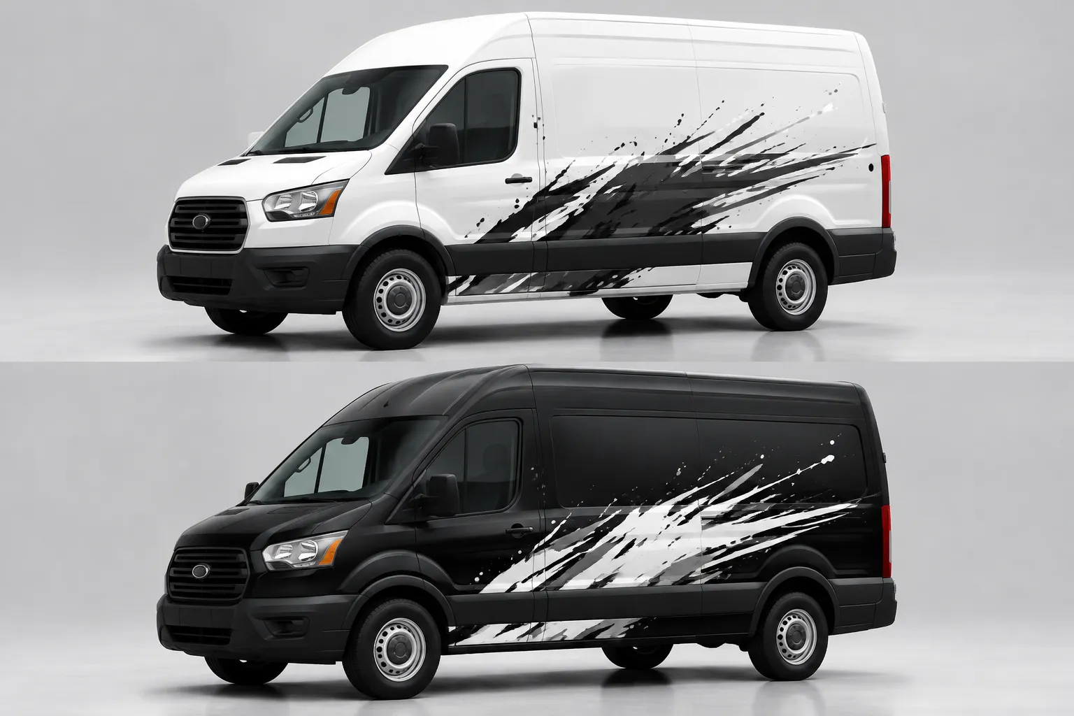
White often separates dark logos, saturated color fields, and fine outlines from the body. Black can give light marks and restrained accents a more concentrated read. Those are starting observations, not final judgments. Body lines, glass areas, wheel arches, door seams, reflections, and retained base paint can reverse the apparent advantage.
Compare matched variants first. Then select the colorway whose primary mark survives at the intended distance, whose secondary information stays subordinate, and whose fleet identity remains recognizable across the required profiles.
Black Versus White Fleet Graphics at a Glance
Treat the vehicle color as part of the composition, not as an empty background.
| Review point | White-vehicle variant | Black-vehicle variant |
|---|---|---|
| Primary logo | Dark or saturated marks may separate clearly from the body. | Light marks may gain strong separation from the body. |
| Large color fields | The white body can remain active negative space. | The black body can frame lighter graphics or join the graphic mass. |
| Fine details | Pale details may disappear without a darker boundary. | Dark details may merge with the body without a lighter boundary. |
| Glass-line transition | Dark windows may read as a separate band against lighter bodywork. | The body and glass may visually connect in some views. |
| Fleet consistency | May suit a system built around dark typography and limited applied coverage. | May suit a system built around light typography and controlled accent coverage. |
| Main concern | Unstructured white space or weak pale elements. | Lost dark details or an overly dense silhouette. |
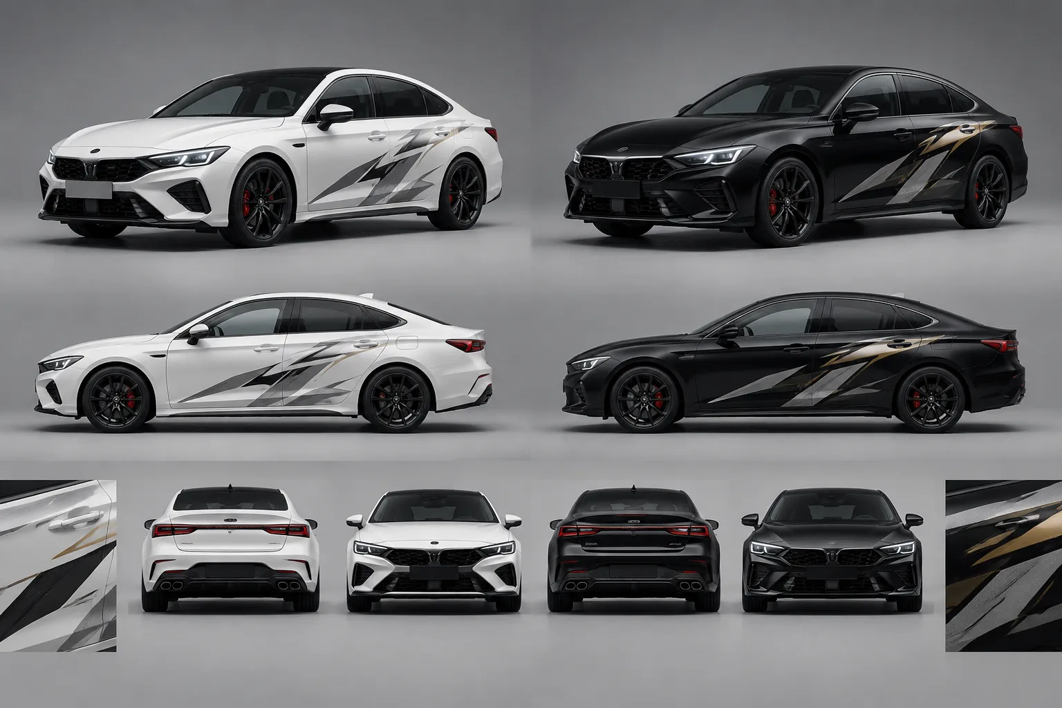
This comparison identifies what to inspect. It does not establish how a material will print, conform, age, or appear under real lighting.
Hold the Comparison Steady
The review becomes unreliable when the white vehicle receives one composition and the black vehicle receives another. Keep the design system fixed before judging the base color.
- Use the same vehicle model, trim, wheelbase, roof height, and visible equipment.
- Show the same side, front, rear, and three-quarter views.
- Keep logo size, placement, sponsor tiers, and information order consistent.
- Match graphic boundaries at every door seam and panel break.
- Use the same lighting, background, crop, and rendered exposure.
- State the viewing distances represented by each comparison.
Do not enlarge a logo on the darker vehicle simply because its first draft reads poorly. That changes two variables at once. Compare equal layouts first, then record any color or background-field correction as a separate revision.
Inspect the Primary Read First
Begin with the element that must be recognized first: the fleet brand, operating division, service category, race number, or principal sponsor. The project brief should identify that priority before the comparison begins.
Reduce both matched mockups to the intended distance view and inspect three things:
- Recognition: Does the primary mark remain a distinct form?
- Separation: Does it stay apart from the body, glass, and nearby graphics?
- Order: Does it appear before secondary copy, partner marks, or decoration?
For example, a dark blue wordmark across the front door may remain distinct on white while the body supplies open space. On black, the same mark may merge with the base and need a light field, outline, or another documented color treatment.
That does not automatically select white. The added field on black may create a stronger fleet identifier. The visible tradeoff is between using the body as negative space and introducing a controlled graphic container.
Compare Contrast as a Relationship
“Black has more contrast” and “white is more visible” are incomplete conclusions. Contrast belongs to a specific foreground-background relationship under a stated viewing condition.
Inspect each required element against its immediate background:
- The primary logo against the painted body or applied field.
- Secondary copy against the graphic beneath it.
- Sponsor marks against their assigned tier area.
- Unit numbers against doors, fenders, or rear panels.
- Accent stripes where they cross paint, graphics, and panel gaps.
- Contact or service information at its intended reading scale.
A grayscale preview can reveal value relationships, but it does not reproduce real viewing, material, lighting, or color behavior. Keep the full-color, vehicle-specific mockup as the decision surface.
Follow the Graphic Across the Vehicle
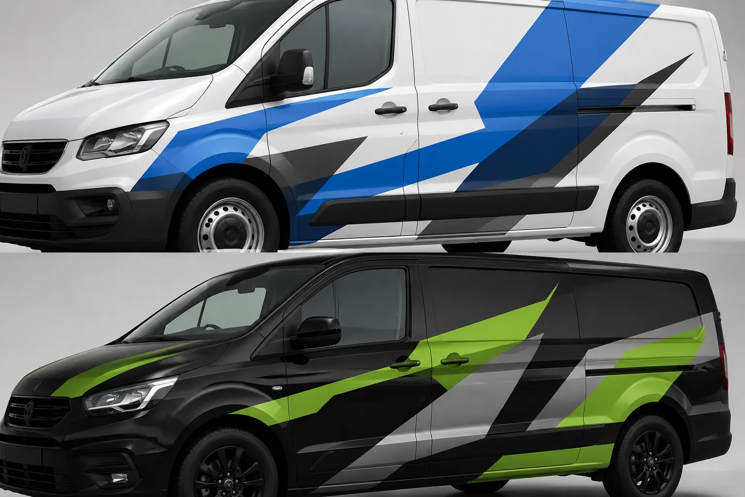
A flat composition can weaken on a vehicle profile. Door seams, handles, fuel doors, wheel arches, lamps, glazing, trim, and changing contours interrupt the graphic path.
On white, a dark graphic crossing several panels may make each interruption conspicuous. On black, a light graphic can produce the same effect. Neither condition is inherently wrong. The question is whether the interruption damages the intended read.
- Does a door seam split a critical letter or logo feature?
- Does the wheel arch remove the center of an identifying shape?
- Does a contour compress an important color band?
- Does the glass line interrupt the hierarchy or support it?
- Does a handle land inside small text or a sponsor mark?
- Does the rear door divide contact information into separate reads?
Review the answer on the correct vehicle drawing or measured artwork, not a generic silhouette. A concept render can show visual intent; it cannot confirm dimensions or fit.
Read It at Distance
Close inspection rewards detail. A vehicle seen briefly offers less time for searching, so the comparison must test whether the hierarchy survives reduced detail.
- Close stationary view: Inspect spacing, panel interruptions, and local contrast.
- Mid-distance profile view: Check the primary brand, service category, and large graphic structure.
- Reduced or motion-context view: Check what remains dominant without relying on small copy.
The reduced view is a concept-stage hierarchy check, not a performance or road-use determination. Academic research on black-and-white striped vehicles found that simulated identification varied with lighting, vehicle size, color treatment, and whether participants viewed the front or rear. It did not test matched fleet wraps, so it cannot establish that either colorway is easier to recognize in this application.
Its useful boundary is narrower: viewing conditions and vehicle form can change the result. Repeat the comparison at the front, rear, and three-quarter views, and label the represented lighting condition.
Keep Sponsor Tiering Intact
Sponsor systems can expose differences between the two bases because supplied marks may include dark-only, light-only, or full-color versions.
- Tier one: Principal fleet identity or primary sponsor.
- Tier two: Major partners or operating division.
- Tier three: Supporting marks and required identifiers.
- Utility information: Unit numbers and project-specific operational labels.
Set the hierarchy before selecting the logo version that looks strongest in isolation. If every light sponsor mark receives maximum contrast on black, supporting partners may overpower the fleet identity. The equivalent problem occurs when numerous dark marks compete on white.
Use documented logo assets and approved variations where those records exist. A visually suitable mark does not demonstrate permission to use it. Send unresolved versions, territory restrictions, placement rules, and sponsor conflicts to the rights holder or project owner.
Compare Fleet Consistency, Not Identical Coverage
A mixed fleet may include vans, pickups, hatchbacks, sedans, buses, or specialist bodies. The same artwork cannot simply be stretched across every profile.
Consistency can come from repeatable identity cues:
- A stable primary mark position relative to the glass line.
- A repeatable front-to-rear color sequence.
- A recognizable graphic angle or body-line relationship.
- Consistent sponsor tiers.
- A controlled rear-panel information order.
- A documented rule for light and dark logo variations.
Research on visual communication in shared-mobility fleets discusses color and branding consistency as parts of fleet recognition. Its survey context does not determine whether black or white is preferable, and it does not evaluate matched wrap designs. It supports only the limited point that recognition should be considered across the fleet rather than vehicle by vehicle.
Place every required profile on one review sheet. A colorway that holds on a large, uninterrupted van side may fragment on a pickup with separate cab and bed panels.
Common Comparison Errors
Judging Different Compositions
A minimal white layout and a heavily covered black layout are not a controlled colorway comparison. Equalize content, scale, and placement before drawing a conclusion.
Reviewing Only the Side
The rear may contain a different ratio of glass, paint, lamps, doors, and hardware. Repeat the hierarchy check at the rear and three-quarter views.
Letting the Background Favor One Variant
A black vehicle on a dark background can lose its silhouette, while a white vehicle on a bright background can do the same. Use a neutral, matched review environment and inspect the vehicle edge.
Confusing Detail With Recognition
Thin lines and small sponsor marks may look precise at full zoom but contribute little at reduced scale. Record which elements disappear and whether their loss changes the required message.
Treating a Mockup as Production Evidence
An approval image does not establish measurements, print color, material suitability, panel fit, installation behavior, or local road-use requirements. Those items require current project records and confirmation from the responsible producer, installer, vehicle owner, or other responsible party.
Record the Colorway Decision
Do not record the outcome as “black looks better” or “white is cleaner.” Those statements cannot direct the next revision.
Select the white-vehicle variant for concept development on this van profile. In the matched side and rear mockups, the primary dark mark remains distinct at the reviewed scales without an added background field. Revise the pale secondary identifier at the rear, confirm its position against vehicle measurements, and send sponsor variations for rights-holder confirmation.
A black-vehicle decision could be recorded this way:
Select the black-vehicle variant for concept development on this pickup profile. The light primary mark remains the first read across the cab and bed, while the black body connects the glass line to the rear graphic field. Reduce the secondary sponsor tier, inspect the bed seam on measured artwork, and assign material and production questions to the producer and installer.
The useful endpoint is specific: one selected direction, one stated viewing basis, and a short list of unresolved dependencies.
Record the Handoff
- The selected black or white base-vehicle variant.
- The exact vehicle profile represented.
- The matched views and viewing scales compared.
- The primary, secondary, and sponsor hierarchy.
- Any graphic interrupted by a seam, contour, handle, or wheel arch.
- Differences required for other fleet profiles.
- Assets or logo variations awaiting rights confirmation.
- Measurements awaiting vehicle-owner or installer confirmation.
- Color, material, print, and preflight questions assigned to the producer.
- Local road-use or visibility questions assigned to the responsible project party.
Matched mockups can establish which colorway presents the stronger observable hierarchy on a specified vehicle profile. They cannot, by themselves, establish fit, material behavior, permissions, regulatory status, or installation readiness.