Fleet Identity Invariants
A fleet logo variation still reads as the same identity when its visible changes leave the strongest recognition cues intact.
That judgment cannot come from the logo file alone. On a vehicle, the mark shares attention with body lines, panel breaks, wheel arches, glass lines, sponsor blocks, color fields, and changing viewing distances. A variation that holds together in a close mockup may lose recognition across a yard, from the road, or beside another fleet unit.
The practical question is whether the same identity survives controlled variation.
More specific pages
These pages continue the topic in smaller, more specific directions.
What Fleet Identity Invariants Mean
Fleet identity invariants are the visual cues that remain stable while other elements change between vehicle types, branches, campaigns, or colorways.
- The relationship between the primary logo and the vehicle body
- A recurring color structure
- A consistent placement zone
- A recognizable graphic direction or motif
- A stable wordmark, symbol, or signature shape
- A predictable hierarchy between the brand and supporting marks
- A repeated balance of open body color and graphic coverage
The exact invariant depends on the brand system and vehicle profile. A compact service van may need a different logo scale and placement from a box truck or race transporter. The identity can adapt to the form without becoming a different visual language.
Consistency is not identical artwork.
Research on vehicle liveries, corporate identity systems, and product-family recognition describes recurring cues as part of visual recognition. That material helps explain why family resemblance matters, but it does not establish a universal logo size, contrast level, viewing distance, or variation threshold. Those decisions remain project-specific.
Start With Hierarchy
Place the base concept and proposed variation on the same vehicle profile. Use the same mockup angle, crop, lighting treatment, and background so the comparison tests the design rather than the presentation.
Inspect the reading order:
- Can the primary brand be located quickly?
- Does the logo remain the leading identity cue?
- Do sponsor or partner marks support the hierarchy rather than compete with it?
- Does the main colorway still connect the vehicle to the wider fleet?
- Does the graphic direction remain recognizable after crossing doors, seams, or contours?
A logo may be technically present while becoming visually secondary. A large sponsor block, dark side graphic, or high-contrast stripe can pull attention away from the primary identity. In this mockup, the visible issue is not necessarily logo correctness. It is hierarchy.
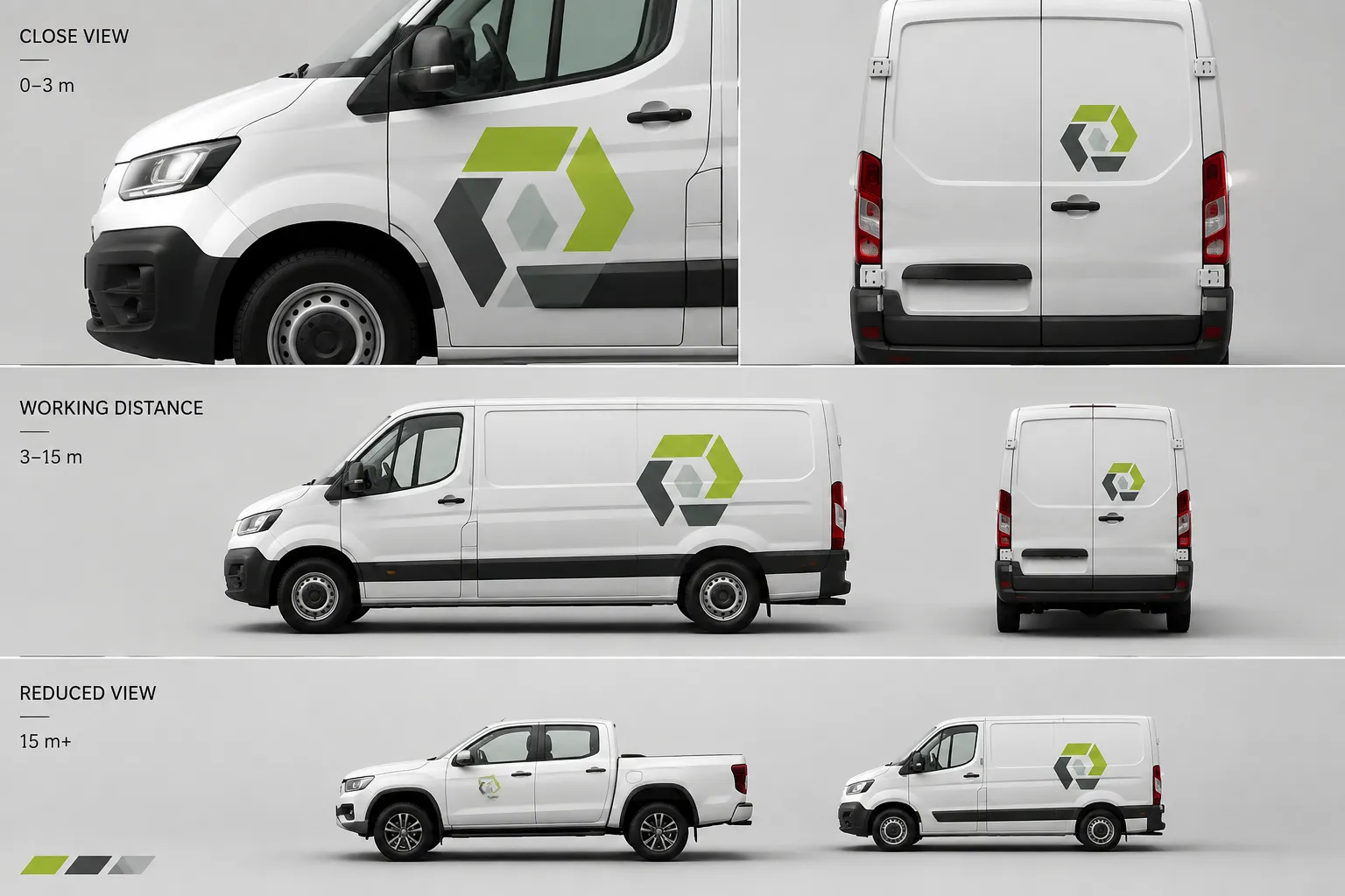
Compare Three Viewing Conditions
- Close review: Inspect the mark, spacing, colorway, and relationship to nearby graphics.
- Working distance: View the full vehicle profile as someone might see it in a yard, loading area, or event paddock.
- Reduced view: Shrink the mockup or review a simplified moving-frame sequence to identify which cues remain.
The reduced view is a concept-stage comparison, not a vehicle-specific visibility assessment. It shows whether the direction depends on fine detail. If the logo disappears first but the color block, silhouette treatment, or recurring stripe still identifies the fleet, some family resemblance may remain. If every cue disappears except a generic color field, the concept needs closer review.
Which Visual Cues Carry the Identity?
A fleet identity rarely rests on one element. Recognition often comes from a combination of repeated cues, and the balance between them can change from one vehicle profile to another.
Logo Form
The symbol or wordmark may be the most direct identity signal, but its effect depends on scale, contrast, orientation, and surrounding space. A logo placed across a door seam can appear interrupted even when the artwork itself remains unchanged.
Inspect whether the mark:
- Crosses a handle, seam, hinge, or wheel arch
- Remains readable on the chosen body plane
- Has enough separation from the surrounding color in the mockup
- Competes with a sponsor tier or product message
- Remains visually connected to the wider livery
These are observations about the concept. They do not confirm final fit, printed color, material behavior, or installation suitability.
Color Structure
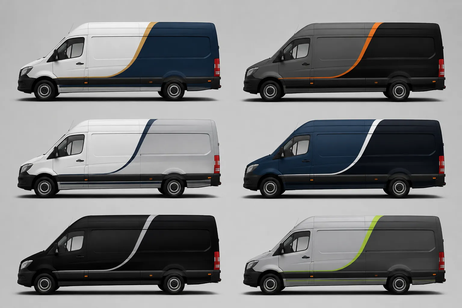
A colorway variation can preserve identity when the relationship between colors remains recognizable. The primary field may stay dominant while a secondary accent changes. A broader swap can alter the perceived hierarchy even when the logo remains unchanged.
Compare colorways by structure rather than screen impression alone:
- Which color occupies the largest visible area?
- Where does the accent begin and end?
- Does the color division follow the body form or fight it?
- Does the logo sit on the same visual field?
- Does the vehicle still resemble other fleet units at a distance?
Screen color does not establish final printed color. Color reproduction, material behavior, and project tolerances require current production specifications and confirmation from the responsible producer or installer.
Graphic Direction
Repeated lines, angles, blocks, or motifs can make different vehicles feel related. The relevant question is whether the graphic language remains visible after adapting to each body shape.
A diagonal that runs smoothly along one panel may fragment on a vehicle with a short rear quarter. A broad side block may dominate a van but become compressed on a cab. The same artwork can therefore produce different identity signals across profiles.
Follow the body, preserve the cue.
The designer should identify which parts of the graphic are essential and which parts are flexible. That distinction belongs in the fleet branding guidelines or project brief before multiple vehicle variants are compared.
Vehicle Form Changes the Answer
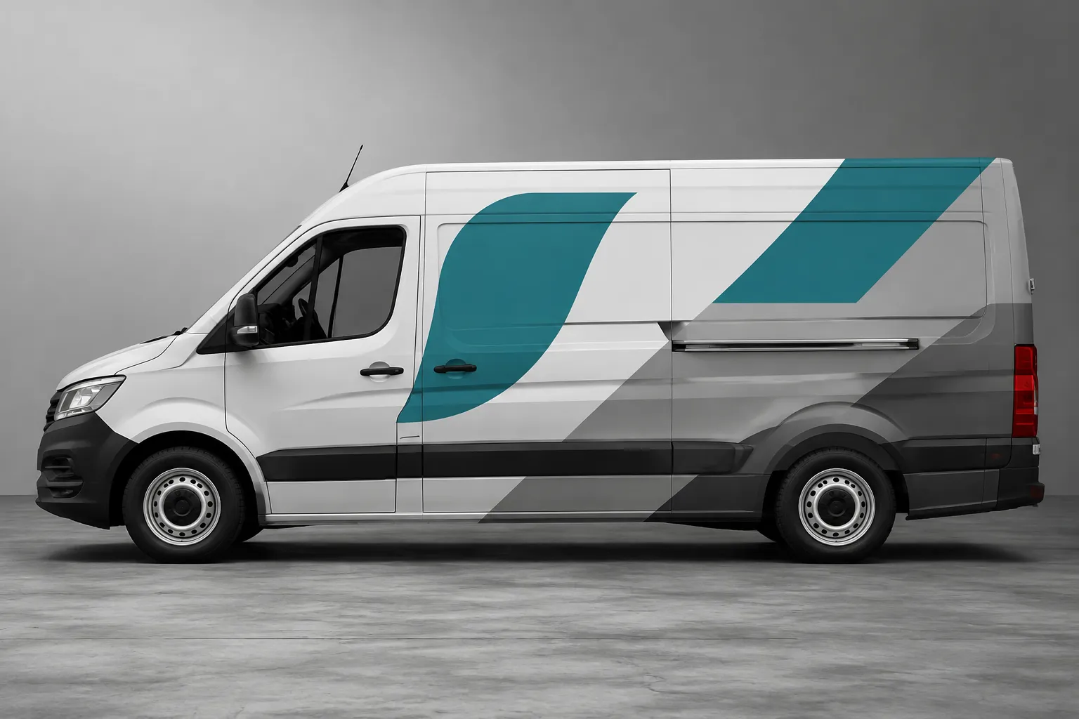
Vehicle form is an active part of the identity review, not a neutral surface.
Doors create interruptions. Wheel arches remove usable graphic area. Windows divide the side profile. Recessed panels change the apparent weight of a color field. Cab shapes and rooflines alter the balance between front, side, and rear views.
Hold the same identity direction against each relevant profile and inspect:
- Body lines
- Panel breaks
- Wheel arches
- Glass lines
- Door seams
- Handles and hardware
- Cab-to-box transitions
- Rear corners and service access areas
Then record what the form does to the hierarchy. A logo positioned high on a flat box body may read clearly. On a lower cab door, the same position may compete with a handle or wheel arch. A color band that anchors one vehicle may look like an unrelated stripe on another.
Review the variation as a vehicle-specific composition. The source artwork can remain consistent while its placement logic changes.
Variation Versus Identity Loss
Variation becomes harder to judge when several identity cues change at the same time.
A small logo adjustment may be manageable when the color structure, placement zone, and graphic direction remain stable. A colorway change may also work when the logo relationship and body treatment remain familiar. The visible tradeoff changes when the logo, color hierarchy, placement, and motif all shift together.
| Variable | Base direction | Proposed variation | Review question |
|---|---|---|---|
| Primary logo | Fixed mark and placement zone | Altered scale or position | Does the logo still lead the reading order? |
| Main color field | Dominant fleet color | Reversed or replaced field | Does the vehicle still belong to the same visual family? |
| Accent graphic | Repeating angle, stripe, or block | New direction or density | Is the recurring cue still visible? |
| Sponsor tier | Supporting position | Larger or more prominent mark | Has the sponsor become the primary identity? |
| Vehicle adaptation | Profile-specific arrangement | Reflowed layout | Does the body form support the same hierarchy? |
| Viewing condition | Full-size close mockup | Distance or motion-oriented view | Which cues survive reduced attention? |
The ledger does not produce a universal score. It records where the concept changed and what that change appears to affect.
A Repeatable Fleet Consistency Workflow
A branch-level review should end with a recorded decision rather than a general preference.
1. Establish the Reference Variant
Choose a preferred concept-stage direction as the comparison reference. Record its logo position, dominant color relationship, graphic direction, and sponsor hierarchy.
Do not rely on memory. A reference image or revision record gives later reviewers a stable point of comparison.
2. Hold the Viewing Condition Steady
Place all variants on the same vehicle profile and review them at the same angle and scale. Add a distance-oriented view when the fleet will commonly be recognized from farther away.
Keep presentation variables stable. Otherwise, the review may measure the mockup treatment rather than the identity variation.
3. Mark the Invariants
Circle the cues that should remain recognizable. These might be the primary logo relationship, a color split, a recurring stripe, or a fixed sponsor tier.
Mark flexible elements separately. An accent angle may adapt around a wheel arch while the logo zone remains stable.
4. Inspect the Vehicle Form
Trace the body lines and panel breaks through the artwork. Note where the logo, color field, or graphic motif becomes interrupted.
Use concrete observations:
- “The wordmark crosses the rear door seam.”
- “The accent band narrows sharply before the wheel arch.”
- “The sponsor block is larger than the primary logo at working distance.”
- “The rear profile retains the color structure but loses the diagonal cue.”
Another reviewer can inspect these statements under the same condition.
5. Test Recognition at Distance
Reduce the mockup until the vehicle becomes a small profile, or use a short sequence that changes its apparent distance. Review whether the same identity cues remain.
This concept-stage test can reveal a hierarchy problem. It cannot establish road-use visibility, motion performance, or an installation outcome.
6. Record the Decision and Open Questions
Choose one working outcome:
- Retain: The variation changes a flexible element while the main identity cues remain coherent.
- Revise: The variation creates a visible hierarchy or vehicle-form problem.
- Escalate: The concept cannot be judged without project-specific records or responsible-party confirmation.
Assign unresolved questions to the person who can answer them:
- Designer: Which cues are invariant, and which may change?
- Brand owner: Which logo, color, and hierarchy rules apply?
- Sponsor or rights holder: What mark-use conditions and placement limits are documented?
- Producer: Which color and file specifications govern the handoff?
- Installer: How do measurements, panel geometry, material behavior, and access points affect the layout?
- Vehicle owner or applicable authority: Which current road-use or visibility requirements apply?
Common Mix-Ups in Logo Variation Review
“The Logo Is the Same, So the Identity Is the Same”
The mark may be unchanged while its context changes completely. A logo surrounded by the established color structure can read differently from the same logo placed inside a new graphic system.
Review the relationship, not only the asset.
“Matching Colors Are Enough”
A shared color does not necessarily preserve the same identity. If the color occupies a different area, moves to a different body zone, or loses its relationship to the logo, the fleet may appear fragmented.
Compare proportion, placement, and contrast across the full vehicle composition.
“Every Vehicle Must Use One Exact Layout”
Strict repetition can fail when vehicle profiles differ. A layout that ignores doors, wheel arches, or cab geometry may look inconsistent despite using identical artwork.
Fleet consistency usually requires stable rules with controlled adaptation. The governing question is whether the adaptation preserves the intended hierarchy.
“A Close Mockup Shows Everything”
Close views favor detail. They can hide the fact that the logo loses priority at distance or that the color structure becomes generic when the vehicle is reduced.
Use close inspection to study the concept and a distance-oriented view to inspect hierarchy.
“More Sponsor Area Means More Identity”
A larger sponsor mark may attract attention while weakening the fleet’s primary identity. Sponsor hierarchy should be reviewed against the brand system and documented rights conditions, not judged only by apparent size.
When a Colorway Needs a Second Review
Return to the comparison when the colorway changes the reading order or moves the logo onto a different visual field.
- The primary logo changes from a light field to a dark field
- The dominant body color is replaced rather than adjusted
- The accent becomes the largest graphic element
- The logo loses its surrounding space
- The color split no longer follows the vehicle’s main contour
- The new colorway applies only to one branch without a recorded reason
- The screen mockup suggests a color difference that production files cannot yet define
Do not assign a numerical tolerance from a visual comparison alone. A color decision may require current brand rules, production specifications, physical samples, or confirmation from the responsible party.
A Practical Sign-Off Record
A useful record separates what the mockup shows from what remains unresolved.
Concept Observation
- The primary logo remains visible on the front and side profiles.
- The dominant color field remains consistent with the reference direction.
- The rear profile loses part of the recurring graphic cue.
- The sponsor block attracts more attention than the brand mark at reduced scale.
Decision
- Retain the front and side arrangement.
- Revise the rear graphic treatment.
- Recheck sponsor hierarchy before the next review round.
Dependencies
- Confirm vehicle-specific measurements.
- Confirm current logo and color rules.
- Confirm sponsor mark permissions and placement conditions.
- Confirm production specifications with the producer.
- Confirm material and installation questions with the installer.
- Check applicable road-use requirements with the responsible party.
This record keeps a visual preference from becoming an unsupported production conclusion.
Frequently Asked Questions
How do I know whether a fleet logo variation still reads as the same identity?
Compare the variation with a reference concept on the same vehicle profile and under the same viewing conditions. Check whether the primary logo relationship, color structure, graphic direction, and hierarchy remain recognizable. No universal threshold answers this for every fleet.
Should the logo stay in exactly the same position on every vehicle?
Not necessarily. Vehicle form may require a different position or scale. The placement rule should preserve the intended hierarchy while accounting for doors, seams, wheel arches, windows, and other physical interruptions.
Can a different fleet color still belong to the same identity?
It can, depending on the brand rules and the other cues that remain stable. Compare the dominant color area, logo relationship, accent structure, and distance-oriented reading. Treat final color reproduction as a production question requiring current specifications.
How should I review a logo variation on a vehicle mockup?
Use matched mockups, inspect the full profile, trace the body interruptions, and compare close, working-distance, and reduced views. Record observable changes separately from questions requiring measurements, rights records, production files, or installer confirmation.
What should happen when the brand and sponsor compete?
Record which mark leads at each viewing condition. Then review the documented sponsor hierarchy and brand rules with the appropriate owner or rights holder. A concept-stage mockup can reveal a hierarchy conflict, but it cannot establish permission or final authorization.
Does fleet consistency mean every vehicle must look identical?
No. Consistency can allow controlled variation for different body forms and operating roles. The important distinction is between flexible layout elements and identity cues that the fleet intends to keep stable.
The Working Verdict
A fleet logo variation remains within the same identity when the change is controlled, the main recognition cues remain legible, and the vehicle-specific adaptation does not reverse the intended hierarchy.
Review the base concept and variation together. Hold the viewing condition steady. Inspect the logo against body lines, panel breaks, wheel arches, glass lines, and door seams. Then reduce the view and check whether the identity survives without relying on fine detail.
Record what the mockup demonstrates. Route measurements, color reproduction, material behavior, fit, installation, road-use visibility, sponsor hierarchy, and trademark permissions to the responsible party with current project documents.
The decision is not “same artwork” or “different artwork.” It is whether the visible system still reads as one fleet identity under the conditions that matter.
Sources
- Branding identity, development and application: a comparison of rail and road vehicle liveries
- A semantic approach to the relationship between brand identity and exterior product design for visual brand recognition, through a case study on local commercial vehicle brand, Temsa
- Suggested considerations for creating a coporate style manual
- Balancing design freedom and brand recognition in the evolution of automotive brand styling
- Designing Visual Recognition for the Brand